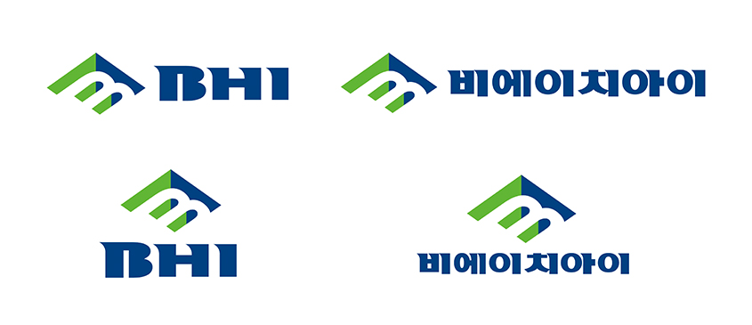
Corporate Identity Introduce
The design of the Symbol is motivated by “B” of “BHI” and is expressed with a sense of space.
SYMBOL MARK

The Identity is designed into two styles: Symbol Type and Logo Type.
The design of the Symbol is motivated by “B” of “BHI” and is expressed with a sense of space.
The symbol shows that as a power plant specialized company BHI has a strong basis, and portrays the company’s high status possessing specialized technical skills and
knowhow of engineering, installing, and constructing.
The diamond shaped SQUARE represents the company’s challenges and vision towards both the domestic and the international markets. Moreover, this identity reflects the
company’s management philosophy of balanced development of the Nation by applying locally distinctive colors where the headquarter is located.
Basic & Single Color

SIGNATURE
Main CI & Sub CI

MAIN COLOR
BHI Blue
Pantone 294G
C 100 M 68 Y 7 K 28
BHI Green
Pantone 368C
C 63 M 0 Y 97 K 0
BHI Light Gray
Pantone Warm Gray 2C
C 0 M 0 Y 13 K 14
BHI Cool Gray
Pantone Cool Gray 9C
C 29 M 23 Y 16 K 51

